Strategic Design Fellows
As a member of the Strategic Design Fellows at the University of Maryland, I had the opportunity to rebrand companies, websites, and products, craft promotional campaigns, and pitch ideas to seasoned business professionals for feedback. My involvement in comprehensive personal branding projects utilizing Adobe Creative Suite has honed my ability to collaborate within teams and develop innovative rebranding proposals showcased in competitive case competitions. Below are a few examples of my completed work from this program
Brand Agency Logo
In my Advertising and Branding class, we had to create “Advertising Agencies” staffed by students based on their preferences and areas of interest; research, media, design, creative, and administration. Each agency had to compete on projects for a specific product or service, and the competitions were evaluated by current industry experts/clients.
As an agency, four other teammates and I were tasked to create a logo. My title in the agency is the art director of my agency, so I took the lead on our agency logo design.
Company Rebrand: McMillan Metro & Faerber
Retail Pitch
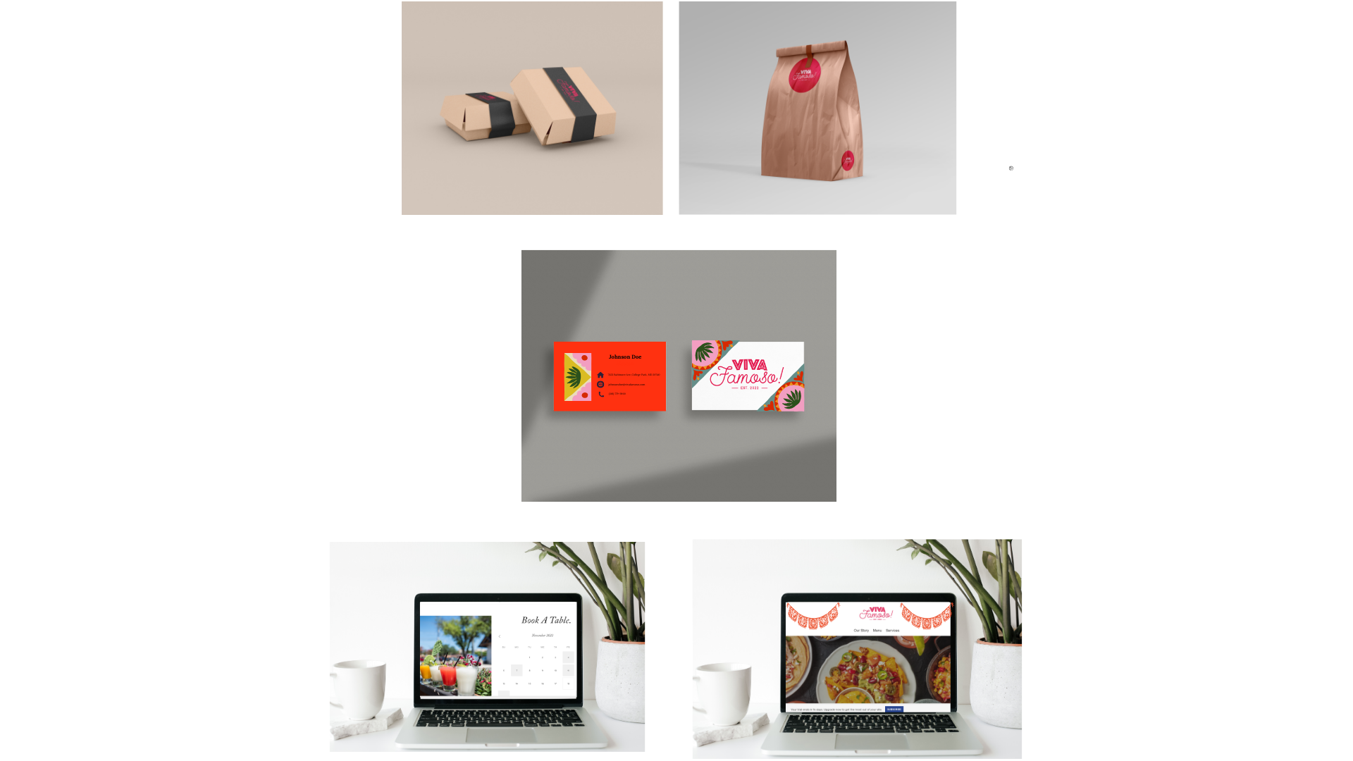
In my Principles of Design class, a few of my classmates and I were tasked with developing a business idea for College Park, Maryland, home to the University of Maryland. The assignment's core aim was to create a company that bridges the gap between College Park's permanent residents and the student community. After gathering primary and secondary research, we developed a pro forma analysis, product mix, virtual store layout, company website, and various marketing strategies.
Squared: Exponentially Greater
Our logo isn't just a pretty picture; it's a visual declaration of our brand promise: exponentially greater. We wanted a design that embodied boldness, growth, and unwavering confidence, and this is what we created:
1. Eye-Catching Color Collision: Squared explodes with a dynamic clash of colors, representing the energy and ambition that drive us forward. These colors aren't just aesthetically pleasing; they symbolize boldness and creativity, perfectly capturing the essence of our brand.
2. Building Blocks of Success: Our custom blocky font isn't just playful; it's a deliberate reflection of our name and mission. Think of each letter as a building block, stacking together to form something bigger and stronger. And hidden within one of those blocks? A tiny square, a subtle nod to our brand name that adds a touch of memorability.
3. Reaching for the Skies: Look closely above the name "Squared." That's not just a line; it's a greater than symbol, a visual shorthand for our brand promise. It's a constant reminder that we strive to push boundaries, reaching for exponential growth in everything we do.
This logo isn't just an image; it's a manifesto. It's a declaration to the world that Squared is bold, ambitious, and always striving to be exponentially greater.
A few of my classmates and I were tasked with rebranding a law firm in the metro DC area. We conducted extensive company research to investigate practical methods for the firm to attract new clients and recruit new employees. We then applied our research findings to refresh the brand, including a new logo and stationery suite. Additionally, we implemented various traditional and digital marketing techniques, such as creating social media platforms and redesigning the company website.


